@Boki_Srb
Depending on what scale to use in the browser, at 100% it looks normal, and also do not forget about the mobile version, everything is fine here.
Welcome guest, is this your first visit? Click the "Create Account" button now to join.
Results 151 to 160 of 256
Thread: SVG developments
-
7th June 2021, 07:01 AM #151

Dear colleagues
in all this creativity, you overlook the main fact - readability.
Shown on modern screens of huge resolution, these icons have a realistic size of a few millimeters.
What can you notice when you look at those few millimeters, from a meter away for a split of a second.
Looks nice on my 24 "screen looking from half a meter, but...
I appreciate what you do, I'm just noticing.
Edit:
Okay, to be a little more explicit. I was supposed to add a pictures to the post this morning, but I wasn't able to, I'm sorry (job).
Spoiler: WHEN WE LOOK AT THE PHONE:
Spoiler: SCREENSHOT
I guess everyone sees the point
So much from me, I'll sort out the posts a little bit later.
-
7th June 2021, 07:14 AM #152


[Only registered and activated users can see links. ]
[Only registered and activated users can see links. ]
[Only registered and activated users can see links. ]
[Only registered and activated users can see links. ]
[Only registered and activated users can see links. ]
[Only registered and activated users can see links. ]
©AF_2020-26
-
7th June 2021, 07:26 AM #153

Icon must be a remotely recognizable symbol, not a thumbnail with useless details, invisible because too small.
Spoiler: ExampleLast edited by spyder; 7th June 2021 at 07:28 AM.
-
7th June 2021, 04:16 PM #154

So what? I set the images of icons to take up half my screen? This is not Luna topic.
You're losing the point again.
When I look at this icon just for a split of a second and see that it is a certain shape and blue, I KNOW that it is a gas station. No need for details. No need to hold the view for three seconds on the screen to decrypt what it represents.
In those three seconds, anything can happen.
That's why I do NOT use skins and I stick to the simplest possible display
I have some ux extras...
This is just my opinion. I know many who use skins just to listen to the guidance, they dont look at the screen at all.
-
16th June 2021, 06:30 AM #155

Last edited by Andrey Form; 7th July 2021 at 09:57 AM.

[Only registered and activated users can see links. ]
[Only registered and activated users can see links. ]
[Only registered and activated users can see links. ]
[Only registered and activated users can see links. ]
[Only registered and activated users can see links. ]
[Only registered and activated users can see links. ]
©AF_2020-26
-
7th July 2021, 07:38 PM #156Banned


- Join Date
- Nov 2020
- Location
- Poland
- Posts
- 195
- Rep Power
- 0
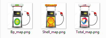
 icon station
... such a small change of svg icons
Spoiler: photo

-
19th September 2021, 10:43 AM #157

Hello,
Here are some "Blazons" !
svg = 120x120
png = 200x200
Spoiler: Examples
-
20th September 2021, 08:38 AM #158
-
20th September 2021, 08:54 AM #159

SVG
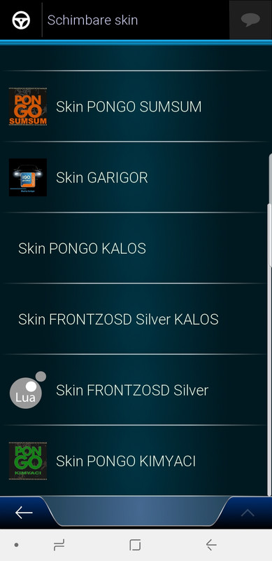
Pongo - Kimyaci
Spoiler: +Last edited by Andrey Form; 20th September 2021 at 05:31 PM.

[Only registered and activated users can see links. ]
[Only registered and activated users can see links. ]
[Only registered and activated users can see links. ]
[Only registered and activated users can see links. ]
[Only registered and activated users can see links. ]
[Only registered and activated users can see links. ]
©AF_2020-26
-
20th September 2021, 04:02 PM #160

Thanks Andrey Form !!!
Could you please increase the size of the text "kimiacy".
Same as SUMSUM.
Spoiler: printscreen


 Likes:

 Reply With Quote


Bookmarks