Hi,
Links are dead.
Welcome guest, is this your first visit? Click the "Create Account" button now to join.
Results 1 to 9 of 9
-
15th November 2013, 05:16 PM #1
 Garmin Winter Activity Central Europe Map
Garmin Winter Activity Central Europe Map
Garmin Winter Activity Central Europe Map
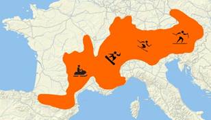
Download your free Winter Activity Map covering Central Europe

This map is based on the community OpenStreetMap (OSM) database and includes thousands of pistes, trails and lifts. This map is searchable and includes a large number of winter POIs (non-routable).
infos:
Spoiler: click
Spoiler: click
Code:Please Login or Register to see the links


You have to navigate to get to the good.
Galaxy S5 Kitkat 4.4.2 / Nuvi1200->1250 / Nuvi3790T->34xx / Nuvi 2200 / Nuvi 66 / Oregon 600
-
15th November 2013, 09:46 PM #2
-
15th November 2013, 10:27 PM #3Junior Member


- Join Date
- Sep 2010
- Location
- Earth
- Posts
- 1
- Rep Power
- 0

Links are working.
-
15th November 2013, 10:27 PM #4p!xeldealerGuest

First link is working for me and there you find a button [Download Now].
Second link is correct but seems to be blocked as deep link.
Maybe this download link from german Garmin site is working (same file as zip):
Code:Please Login or Register to see the links
-
15th November 2013, 11:46 PM #5

For me both links in starting post are working, as usual some Garmin's links don't work for everyone and in every regions.

You have to navigate to get to the good.
Galaxy S5 Kitkat 4.4.2 / Nuvi1200->1250 / Nuvi3790T->34xx / Nuvi 2200 / Nuvi 66 / Oregon 600
-
16th November 2013, 09:38 AM #6

Hi,
I checked this map on a ski resort I know in the Pyrenees : a real disaster !
Ski lift are missing and the worst is that colours of alpin ski run displayed are false !
Any way to make OSM correct this ?
-
16th November 2013, 03:31 PM #7

Check these and let us know if they're better, I guess they are. Single maps are free.
Spoiler: click
You have to navigate to get to the good.
Galaxy S5 Kitkat 4.4.2 / Nuvi1200->1250 / Nuvi3790T->34xx / Nuvi 2200 / Nuvi 66 / Oregon 600
-
17th November 2013, 06:54 PM #8Member


- Join Date
- May 2012
- Location
- Germany
- Posts
- 15
- Rep Power
- 0

I can confirm your observation. I checked myself and also found differences in some ski regions well known to me. However, the declaration of the ski regions oftenly does not give a correct difficulty rating of their pistes in order to look better (more difficult) in comparison to other regions. With the regions I checked, i found different pistes marked blue which I would describe myself being of blue difficulty, which however officially are marked red. Maybe they took 'experienced' data instead of official?
But over all the Winter Activity Map also comes with a quite good topographic map (exact single building in Austria e.g.) as well for free. Unfortunately the contour lines I found only every 100m, but at cursor position you always get correct values of the level above sea.Last edited by Wabu; 17th November 2013 at 07:08 PM. Reason: correction
-
17th November 2013, 07:31 PM #9

sergio2 and Wabu;
I've done this several times and it worked every time!
Preferably, use the "diagnostic log ([Only registered and activated users can see links. ] )" to make a best accuracy trail log of the areas covered by this map; and send it to the author of the map. Don’t forget to tell him that you used the diagnostic log function, your impressions; send some tips on trails or footpaths by which you come too. You will have the developer’s gratitude, and him will launch a new improved version. Everybody wins!
Good work!
PS: send him the GPX directory, preferably zipped (or .RAR); by e-mail.Last edited by Pungente; 18th November 2013 at 05:31 AM.


 Likes:


 Reply With Quote


Bookmarks